Pages

Monday, June 30, 2008

Faery Art in Watercolour

Moonstruck - detail

Moonstruck - initial sketch


Moonstruck - final painting.

As I noticed that some visitors to the site have an interest in faery art, I decided to insert a few clips of a work I did a while back. The yellow sketch shows the initial doodle on a post-it! I didn't really think about what I was going to end up with when I started. I had had a spare moment and I was just killing time at that time and letting my imagination flow. The drawing in pencil turned out okay and so I decided to keep it, and do a larger version, 12" x 16" on watercolour paper. When it came to scaling up I just drew it freehand and tried to keep it as close to the original idea while improving on the form where necessary. When I was happy with the pencil scaleup, I outlined it all with a very thin black felt tip type pen, being careful to not lean too heavy in the important areas, especially around the face. When it came to painting, I had a rough idea about what to do and went with it. The plan was to draw total attention to the centre and to do this I came up with the radiating pattern around the moon. Also the craters on the moon, I choose their location carefully so as not to impact on the outline of the faery. Choosing the colours for the faery was a happy accident as I had choosen a pale green, but decided it was lacking something. So I went over the body with a rose colour and it formed a nice brown. I tried to keep everything balanced so no part of the background colour took away from the faery by being too intense. I would like to think it's an okay effort.

I shall scan the entire picture at a later stage to improve the main picture image, as it is a little unclear.

Faery school - initial sketch

Here again is another sketch, done around the same time, which I have drawn scaled up, and yet to complete. In the scaleup I have included a smaller faery on the rock and she is at faery school. The teacher is the central faery. If I get around to finishing it in the next while I shall include it as an addition to this post or link it back. These sketches often end up in the bin, and I've come to realise that it's not always going to be right first time and end up as a good idea. Some sketches are just that, sketchy! So it's important to just enjoy and see what happens.
Here are some links to well established faery artists on the web. I think their work deserves some credit. They really are good!

That's it for now! I hope this interlude into fantasy was interesting to all.

Saturday, June 28, 2008

Painting a Day Style Art -- Kitten, Oil Painting

Kitten beside mowed field.

This is my latest oil painting, on masonite 7mm gessoed panel, it is 6"x8" size and comes with a small wooden frame which I made myself. The image above is a photo, I shall replace with a scan when the painting is dry (about a week). If you enjoy this painting, feel free to leave a comment.
The price of this painting is $95 (euro 60) including the frame. Just email if interested. Jimsartemail@hotmail.com or visit ebay here.

To see earlier work for sale click here.

Friday, June 27, 2008

Painting a day, unlikely! - Painting a week, maybe!!

My painting of the Grand Canal, Dublin is now dry and I scanned it and replaced the original photo which was on an earlier post with the scanned version. Please click here to see. I am also working on similar painting a day style work, so come back to see my next painting which is due up over the weekend or early next week, if life gets hectic.

Thursday, June 26, 2008

One week old....and counting.

The blog is one week old and is starting to take shape a little. I've learnt a log about the blogosphere. I intend to post two or more times a week on a regular basis. I shall try to show new work as frequently as I can. Thanks to everyone who has visited so far, I appreciate your interest. Please feel free to comment on anything you choose. I appreciate feedback too! And please share this site with any friends who like art. I hope to post interesting and useful information on learning to paint, including some demonstrations of paintings in progress, alongside paintings which I will have up for sale. I am interested in poetry so shall post a poem on occasion, as a diversion from art. Thanks again to all who visited in the first week. Enjoy today's poem...

West wind, where doest thou blow
The small rain down can rain
God, that my love were in my arms
And I in my bed again.

Wednesday, June 25, 2008

Mixing Neutral and Semi-neutral Colours - Part II of a Series.


Link to Part I
Looking at the colours I recommended as a basic selection in my earlier post and using the standard colour wheel:
Our primary colours are:

1.Cadmium Yellow Light (Lemon Yellow)
5.Permanent Rose
9.Thalocyanine Blue

Our secondary colours are:

3.Cadmium Scarlet (Cadmium Orange mixed 50:50 with Cadmium Red)
7.Permanent Mauve (or Ultramarine Violet)
11.Viridian Green

And our tertiary colours are:

2.Cadmium Orange
4.Cadmium Red
6.Permanent Magenta (Ultramarine Violet)
8.Ultramarine Blue
10.Turquoise Blue (Viridian Green and Thalocyanine Blue mixed 50:50)
12.Permanent Green Light

These twelve colours numbered 1 to 12 above are equidistant around the colour wheel.

Okay - now we have a rough idea of what is in our palette. But looking around you and observing nature, unless you are looking at a bright field of flowers you will most likely notice that colours seem to be harder to define. Just what is that particular shade, hmmm , looks like some sort of grey. How do I mix that then? Not on the colour wheel? How can I find that then? We must go back to our colour wheel.

Complementary Colours: We can pair our 12 colours above as follows:

1 with 7
2 with 8
3 with 9
4 with 10
5 with 11
6 with 12

Each of these pairs are what are know as complementary pairs. As you mix the pure colours they will appear to grey out. When mixed evenly each pair will form a perfect neutral. The neutrals are natural looking and not muddy. They are "clean" and look well in paintings. When the mix leans more towards one of the pair we have semi neutral colours created. These are very beautiful colours and greatly enhance the range available to the artist. Practice at mixing helps in developing a feel for how to achieve a certain semi neutral or neutral.

Choice of which pair to mix to get a neutral?

We can help achieve colour harmony in our paintings by choosing to mix our neutral from the complementary colours which are already in the painting. For instance, if the painting is using cadmium red and blue/greens, we can choose 4. cadmium red with 10. Turquoise. If the painting is predominantly yellow/green with hints of purple/blue we can use 1. cadmium yellow light with 7.mauve.

Thats it for today, I will add more at a later stage about using colour. I intend to keep adding to this series so keep coming back for updates, if you want to learn a lot about colour theory. Remember, understanding colour creates beautiful paintings. If you want to be inspired, check out the work of a favourite artist of mine over at the http://www.catto.co.uk/ His name is Nicholas Verrall.

Tuesday, June 24, 2008

Learn to Draw ... forget which side of the brain -- just use your eyes.


How many psychiatrists does it take to change a light bulb? Answer: One, but the light bulb must want to change!


If you are enthusiastic about painting but feel that your drawing ability is holding you back, then I hope the following can help you change the way you think during drawing.

If you enjoy painting, an ability to draw well is a major asset and can move you towards a higher level than your peers. Drawing anything more complex than an apple can sent a lot of people who enjoy painting into a run for the hills. Fine if you are drawing a river or trees, or mountains. Who cares what shape they are as long as they are generally okay. But try drawing a dog or horse (how to draw a horse - part 1), or a child on the beach, then depending on ability, the fun or frustration can really begin. But it doesn't have to be so hard. Allow me to share the thought process I use when I am drawing.


Many drawing books give examples using basic shapes of how to draw a person, a horse or whatever. They break it into squares and circles and slowly refine the image to whatever it is supposed to be. Eventually you rub out the original shapes. This is a laborious approach I feel, and doesn't build confidence because as soon as the person has to draw a different object the learned approach doesn't convert easily.


Well in drawing as in most things, thoughts become actions. So what are my thoughts when faced with a difficult drawing.


The first thing to think about is fitting it all in the picture and in a place on the page that gives the image balance. Look at the object, say for example a dog who is running and facing left. Is his tail long? If I start at the face and I'm in the middle of the page will it all fit in? Maybe I don't want it all to fit in. In that case it would be okay to start in the middle. Or alternatively I can start in the middle but I will have to draw it smaller so it takes up only the right half of the space.


Also I think about the edges of the page. I want at least a little gap between the dog and the edge. A tangent is formed if the dog's body touches the page edge. This always attracts the eye and is bad from a compositional point of view.


So now I am ready to start. I decide which is the easiest place in the image, head or tail? Well, it is easier to draw a tail, but actually harder to work backwards up the body. If it was a dog or horse I usually start with the head. If a church I would probably start with the steeple. Either way, it has to be where you feel most comfortable. But just before you put down the first line is a critical time. Double check exactly where it is to go to fit it all in.


A neat trick if you are working from a photo is to put the page/canvas on the floor/table. Hold the photo in front of your face and look down at the page. Move the photo up and down between your eyes and the page until it and the page edges line up. Now look at the photo and touch the photo with a pencil on the edge of the object, head of the dog for example. Take away the photo but hold the pencil steady. Focus again on the page on the floor. If you got this far, the tip of the pencil is over the point you need to start at. You should see exactly where to start drawing so that it all fits in!! Put a dot on that place and do the same for the other side of the object. Now you just have to make it fit between.


As you gain more experience you can dispense with this method but I still use it sometimes on complex subjects. It's there to fall back on.


That's all about finding the starting point.... I'm going to take a break for the moment but go into more detail on how I actually draw any object when I add to this post or start a further one. If any of this is useful to people, please let me know and I'll keep expanding on it.

Monday, June 23, 2008

Some tips on how to choose a versatile palette for painting Part I of a series


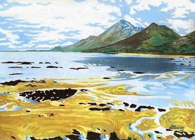
Croagh Patrick, Connemara, Ireland

Said Hamlet to Opthelia
I'll draw a sketch of thee
What type of pencil shall I use?
2B or not 2b?


by Spike Milligan

Choosing a palette of colours is as personal as choosing a bottle of aftershave or perfume. A lot of it is down to personal taste. Whatever pleases the eye. Some people like a lot of dark colours and others never use black. But the most common mistake a lot of people starting out make is to have too much choice in their paintbox. Too much confusion and choice leading to incorrect colour choice and paintings that look unnatural or lacking in coherence. Improving use of colour is probably the best thing a beginner can concentrate on and well worth the effort. The best advice in choosing a palette is to travel light. With sufficient familiarity with the chosen colours most paintings can be well executed with about 15 tubes of paint. What? I hear you say. What about all the really nice shades of green or natural colours that make up the bulk of many landscape paintings.

Well the good news is all can be mixed easily and with a little practice. And once learned it means your next painting trip outdoors will be a lot lighter on the arms.

A good start is to choose a palette of about 15 colours maximum:

Found around the colour wheel roughly equally spaced:
Lemon Yellow
Cadmium Yellow (Medium)
Cadmium Orange
Cadmium Red
Permanent Rose (Like Alizarin but more lightfast)
Permanent Magenta (Midway between Permanent Rose and Permanent Mauve)
Permanent Mauve (Looks deep purple - very close to Ultramarine Violet)
Ultramarine Blue
Thalocyanine Blue (or Cobalt Blue)
Cerulean Blue (or use Manganese Blue)
Viridian
Cadmium Green Pale (or use Permanent Green Light)

Optional additional colours, Inside the colour wheel (Colours that can be mixed from the above which are commonly used):

Yellow Ochre (Mix from Cadmium Orange and Ultramarine Blue)
Raw Umber (Mix from Cadmium Orange and Permanent Mauve / Ultramarine Violet)
Burnt Umber (Mix from Cadmium Red and Cadmium Green Pale)
Venetian Red (Mix from Cadmium Orange, Slightest touch of Cadmium Red and Magenta)
Raw Sienna (Mix from Cadmium Orange and Ultramarine Violet)
Burnt Sienna (Mix from Cadmium Orange and Magenta)

All of these can be mixed from the original list but it might be useful to include some of them. I have not given the proportions of each colour to use in the mixes but try the various colour mixes and see how close you can get to the colours you need.

Titanium White (I prefer to use this as flake white contains lead)

Black is omitted as it can be mixed from the above. Raw Umber with Ultramarine blue gives an acceptable black. This gives a more natural black in my opinion.

The following link shows watercolours average position on a colour wheel and helps in defining their complements.


For Oil Painting the colour distribution is similar.

This is a start to tips on colour use. I will expand on this post when I can. Hope it helps a bit!

Sunday, June 22, 2008

Some older fantasy work and ...New Painting - Grand Canal Dublin, Ireland

The above is an image from my earlier fantasy work. This is called Inverted Desert, and as you might have noticed is a digital inversion of the original Desert of the blue stones, shown below.

Grand Canal Dublin

Up on ebay reserve of $80 (euro50) with frame, see here.
Here is my latest painting - this was a painting a day type experiment. This was done on a masonite panel which is 7mm thick which I cut to size 6 " x 8 ", and then gessoed. The sky is actually very light blue but seems to be more colour saturated in the scanned view. The reality is a slightly paler blue. This painting comes with a white light wooden frame which I made for the painting. It is therefore ready to hang. If you like it please feel free to comment.

Friday, June 20, 2008

Up and Running...


Just to share a little background..I was reflecting on why I started this blog. One of my principle reasons I feel is to share my art with a broader audience, as well as my friends and relations. And wishful thinking, I hope it will somehow encourage me to paint more, as I am currently holding down a different line of work. However from time to time when not working I drag myself back to the "studio" currently my living room and even if it's just for a short hour or two it all adds up. So I hope to become a more productive painter.

It was a few years ago I felt that it was time to loosen up and paint quicker, so like sprinting I set myself a time trial. Three hours to produce a painting, no more. Whatever was done in that time was it! Well I made a few interesting attempts and quite surprised myself with what could be achieved in a short time. Since then I have looked at many Plein Air sites and seen how various artists do this on a regular basis. It really was great to see the freedom and looseness in their styles of painting. It made me realise how intense I had been in some of my work. A measure of that intensity can be seen in Desert of the Blue Stones, which took me quite some time to produce. I might never devote this much time to a painting again, but I might achieve work of a superior standard if I can draw on the examples of other artists who have mastered the use of colour and light. Looking at their works I came to appreciate that mastering the use of colour is paramount to producing your best art.

So this week I might get around to doing another "time trial" and post it here! The image above is an example of an earlier time trial.

The skill level I am currently at is a work in progress. In the pursuit of improving I have looked at hundreds of paintings and read countless books on how to paint, especially the use of colour and light. This has definitely been of benefit and I would like to think I have progressed in the past few years. In that time I have also studied the more practical side of marketing and selling. Yet I still feel if I was never to sell anything I would be a success if I could be happy with the quality of the work I produce. So thats where I am at the moment. The work I am producing now has a more rounded consistent feel to it than my earlier work and I really feel that I am approaching some level of satisfaction with my work. I hope that this blog will be an interesting voyage for me and encourage others to improve their artistic talents!!

Thursday, June 19, 2008

New Blog hits the ground! Watch this space...

Welcome to all...

Welcome to my new Landscape Art Painting Blog. In this blog I shall try to provide step by step demonstration of some of my landscape paintings as well as information on learning to paint.