 Oil Painting Demonstration - Irish Landscape
 As promised, here is the follow on from the initial sketch Part I for this painting of Clew Bay, which I am working on at the moment.
 Painting the Undercoat
The above shows the initial undercoating - the main purpose at this stage is to establish the main colour features for all elements. For the sky, I mixed manganese blue with titanium white and used a number 1 hog hair filbert brush to work in the cloud shapes. I varied the mix proportions to get darker or lighter shadows as necessary. For the mountains I mixed ultramarine blue with the same white for the cloud shadows, and the same blue with white and raw umber (very small amount) to create the grey of the mountains. If the grey turns out correctly mixed, it should have a slight blue feel.
.
 Mixing Green in Landscape Painting
There are a lot of colour combinations to explain in the above, so this is a bit more of an instinctive painting than the last demonstration of painting a snow scene. The main thing about painting landscapes is to avoid having too much of one shade or colour green. This happens a lot for beginners. I try always to avoid this, having areas of similar green too much. Every area of the painting should have some variety. Our eyes are very sensitive to shades in the green spectrum so we can recognise a large amount of different shades. Mixing blues and yellows creates various greens, but knowing what you are doing to get a certain shade comes from knowing the places of the colours you are mixing on the colour wheel.
In the above, and the following pictures I mixed greens as follows:
For darker dull area greens, ultramarine blue with cadium yellow.
For very dark areas, increase the ultramarine blue in the above mix or include viridian green.
For medium bright greens, ultramarine blue with lemon yellow or cobalt blue with cadmium yellow, manganese blue with cadium yellow.
For bright vivid greens, manganese blue with lemon yellow.
To desaturate the colour of a mix, include the opposite colour on the colour wheel to neutralise down the hue. For example, add a hint of cadmium red or permanent rose, very very tiny amount.
I didn't use really bright greens so much in the painting, as they are not needed. Distance also reduces the greens intensity. As a green recedes into the distance it will lose the yellow component and the blue component becomes more obvious. So don't include too much yellow on it's own in the distant parts. It will ruin the aerial perspective effect. Remember warm colours advance, cool colours recede.
.
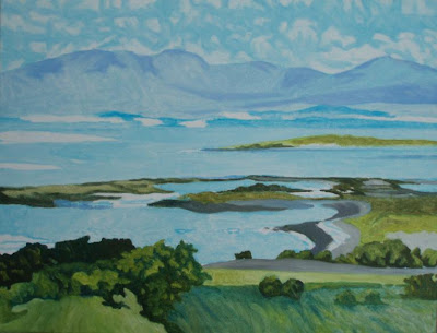 For the grey of the beach areas, you can use a combination of ultramarine blue with raw umber, or cobalt blue with raw umber. The grey can be lightened with titanium white. It's also good to try varying colours away from what you see in the photo. I tried a little area of more purple shade on some beach areas, using ultramarine blue with raw umber.
The water is similar to the sky, and is just a light coat of paint, using manganese blue and white.
I tried to cover the whole canvas with paint at this underpainting stage to remove the white glow of the gesso. This makes it easier to see colour and light balance as I progress on to the final painting. Below is where things are at the end of underpainting. If you are enjoying this demonstration be sure to check back during the next week, as I complete this picture.

No comments:
Post a Comment